Article ADAM Branding
Brand Identity & Digital Design
Project Overview
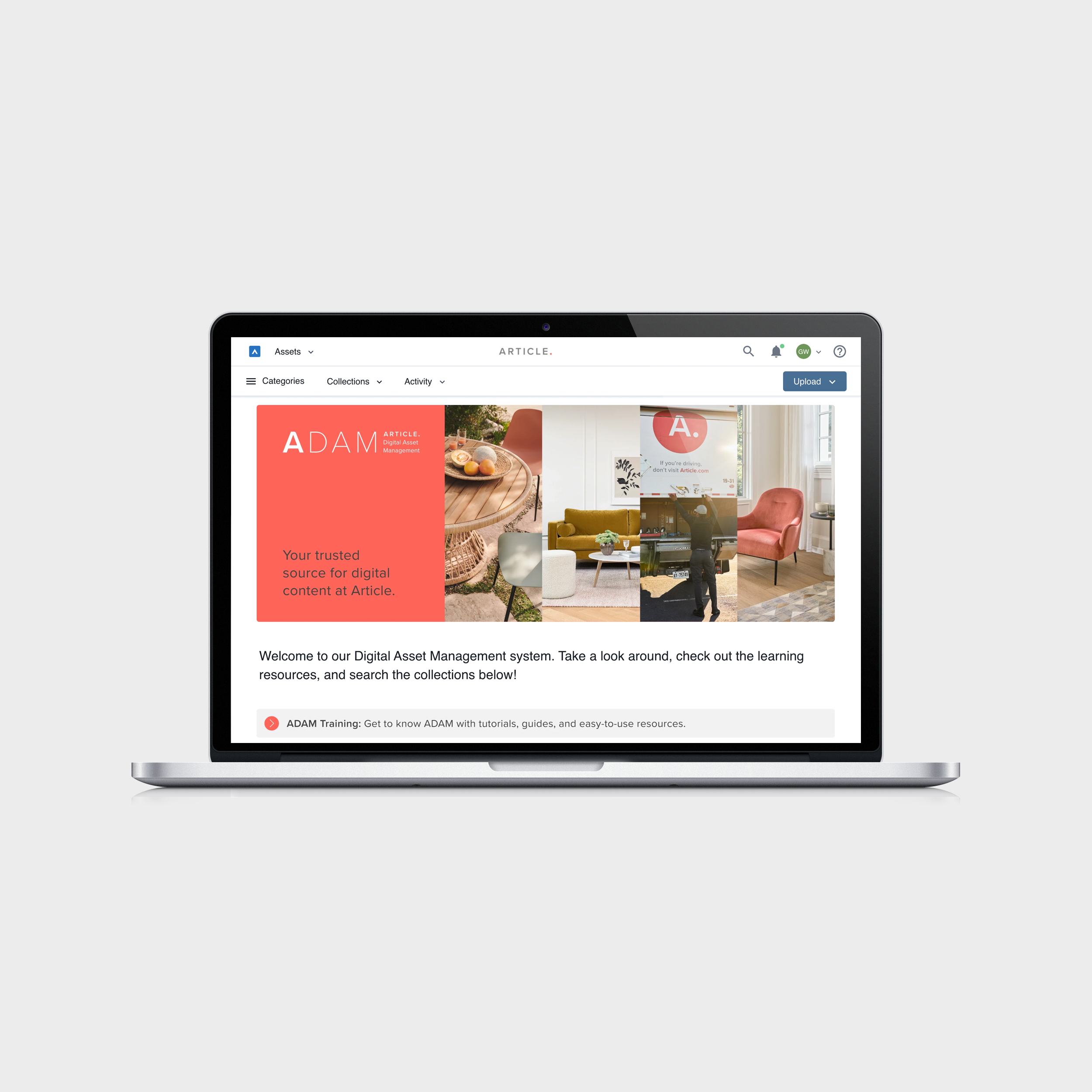
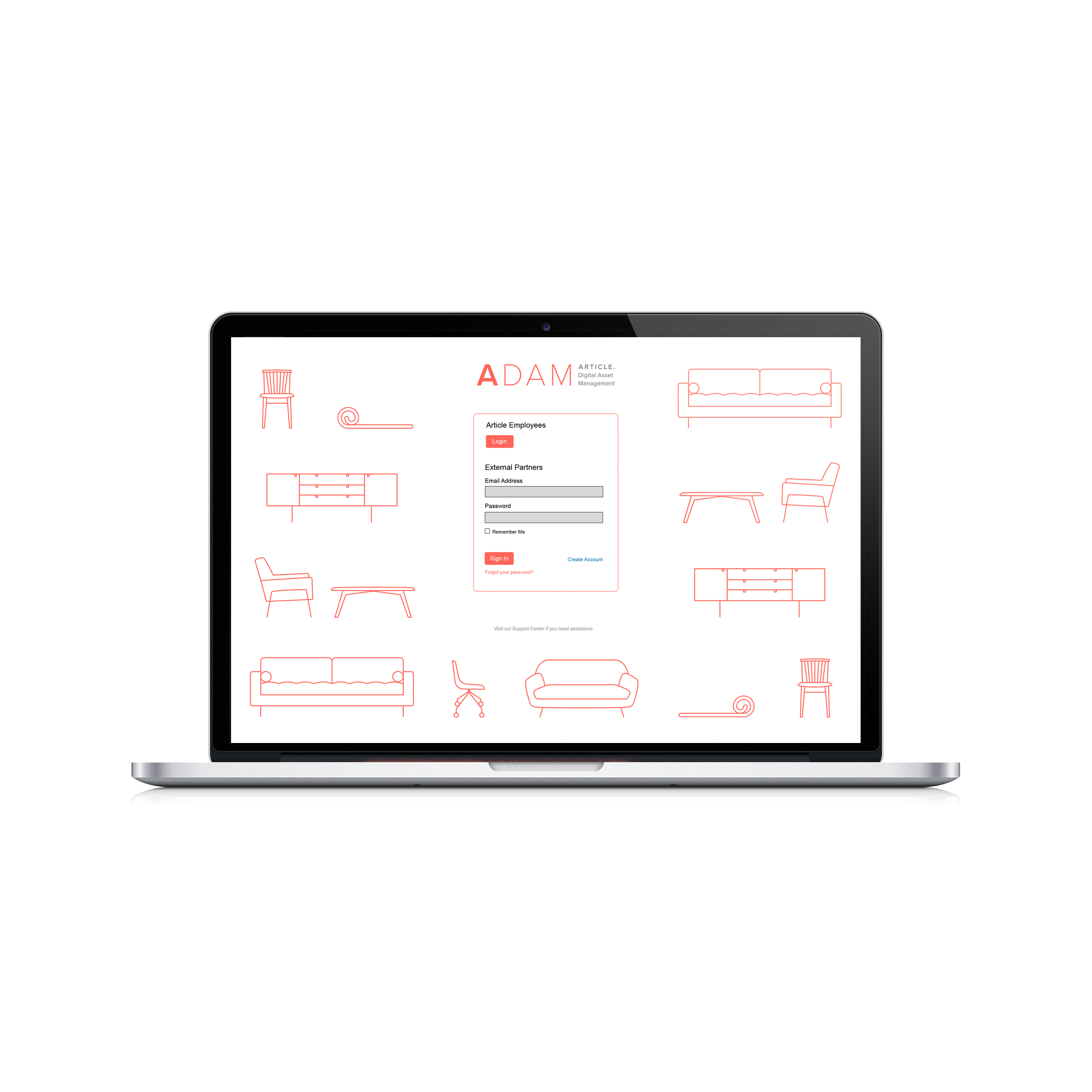
The key purpose of the DAM (Digital Asset Management System) is to serve as the single source of truth for all final digital content at Article. The DAM is hosted by a third-party (Widen) so there is a need for its look and feel to align with Article’s brand standards, including a re-skin of key visual elements and an updated name. The DAM is mainly used internally, but on occasion will also be accessed by external partners.
Design
Working alongside a copywriter who ideated the name “ADAM”, I worked on creating a brand identity that would function alongside Article’s main branding. In addition to this, utilising Article’s brand distinctive brand assets, such as graphic product illustrations and core brand photography, I designed the digital assets for the login screen as well as the main landing page that functions as a starting point to navigate through the DAM.
The “A” from the Article logo contrasting with the thinner type helps showcase the wordplay of reading this logo as the name “Adam” as well as “A DAM” (A Digital Asset Manager). With a human name as the acronym, the DAM is seen as approachable and personable rather than complicated or overly technical.

ADAM Landing Page
The design of this page was using Widen’s existing layout capabilities. I created digital assets to function as buttons which are used as entry points into the DAM. My goal was to create a visually appealing, clear framework of buttons that would help users find the assets that they are looking for.
